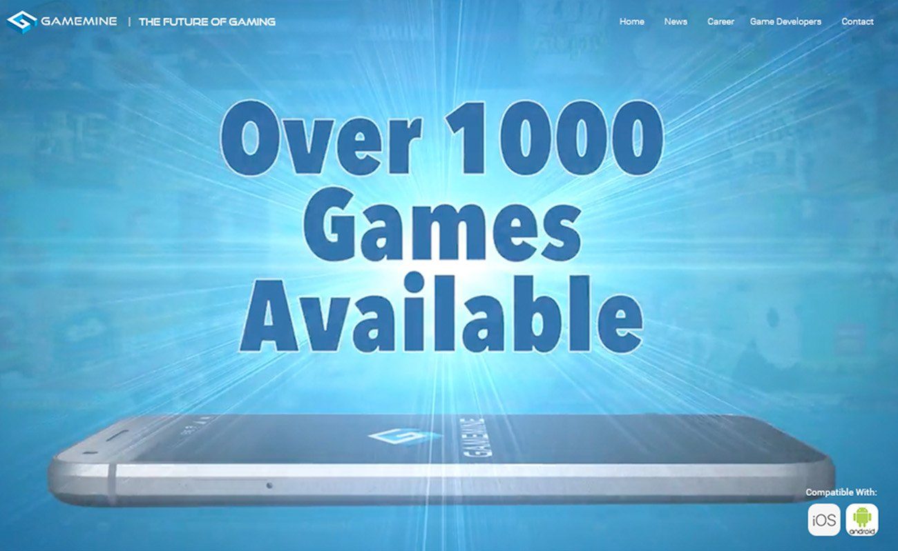
The offer, stated in four words, above a phone with a game running on it.
Homepage, early 2020
GameMine sells a subscription to a thousand games. The site it had was selling the company instead.
The situation
The old site was built like a corporate profile. Titles, About, Team, Blog, Press, Contact. Everything a partner or a journalist might want, and very little that a customer would.
It also looked like software: dark, technical and careful. Nothing about it felt like the thing being sold, which was fun.
I was working there as a design consultant, which meant the problem was visible from the inside.
What we did
Rebuilt the site around the offer rather than the organization. What you get, what you do not get, and how it works, in that order, before anything about the company.
The games became the imagery, running inside phones rather than described in paragraphs. The press coverage moved directly under the hero, where it works as proof instead of sitting on a page nobody visits.
The brief was simple: this should feel like entertainment, not enterprise.
1000+ games, one subscription
Puzzle, action, adventure, racing and strategy through a single access point.
No ads, no in-app purchases
Every game in its full version. The objection answered before it is raised.
Stream or download
Play online or take it with you. The practical question, answered plainly.
Three million subscribers
The proof, stated last. It only lands once the offer makes sense.
Before and after
Titles, team, press, contact. A company introducing itself, with the product somewhere in the middle.
The offer first, the press second, the games shown rather than listed. Captured later in 2020, by which point the library and the subscriber count had both grown.
The campaign
Seven hooks, one skeleton.
The site had to answer three questions before it asked for a card. The paid social had to answer the same three in a single screen, on a phone, in about two seconds. These are the seven that earned the most engagement and the most clicks.
What never moved
The number of games, in the headline, before anything else.
The active player count, as a badge, doing the job the press strip does on the site.
One green button, one word on it, in the same place every time.
The price and the free trial stated under the button, not after the click.
Only the hook changed. The hook is what gets tested, so the hook is what should be free to move. Everything a person needs in order to say yes stayed exactly where it was, which is why a set of seven very different ads still reads as one campaign.
He understood that we needed the site to feel like an entertainment brand, not just a corporate website.John Miller
VP of Marketing, GameMine
A subscription product has to answer three questions before it asks for a card. The design job was deciding their order.
Why this one is here
The judgment does not change with the size of the client.
Most of the work on this page is for businesses in their first years. This one is not, and that is the point. The thinking that rebuilds a national subscription brand is the same thinking a five page site for a local business gets.
There is a longer proof too. Six years on, GameMine has restyled the site, but the structure is still there: the same headline pattern, the same three promises, the same press strip under the hero. The design changed. The argument did not.
What was in it
- Website design
- Website build
- Landing page
- Brand kit
- Marketing campaign
- Social graphics
- UX / UI
Engaged as a design consultant at GameMine. The 2017 capture is from a web archive. The site has been restyled by the company since 2020.
Start here
Tell me what
you're building.
You do not need to know which service you need, or have everything figured out. Describe the business, and I will tell you where I would start and what it would cost.